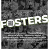
Here is a moodboard of sorts on typography and imagery. This gives the client an early choice in the direction of the project.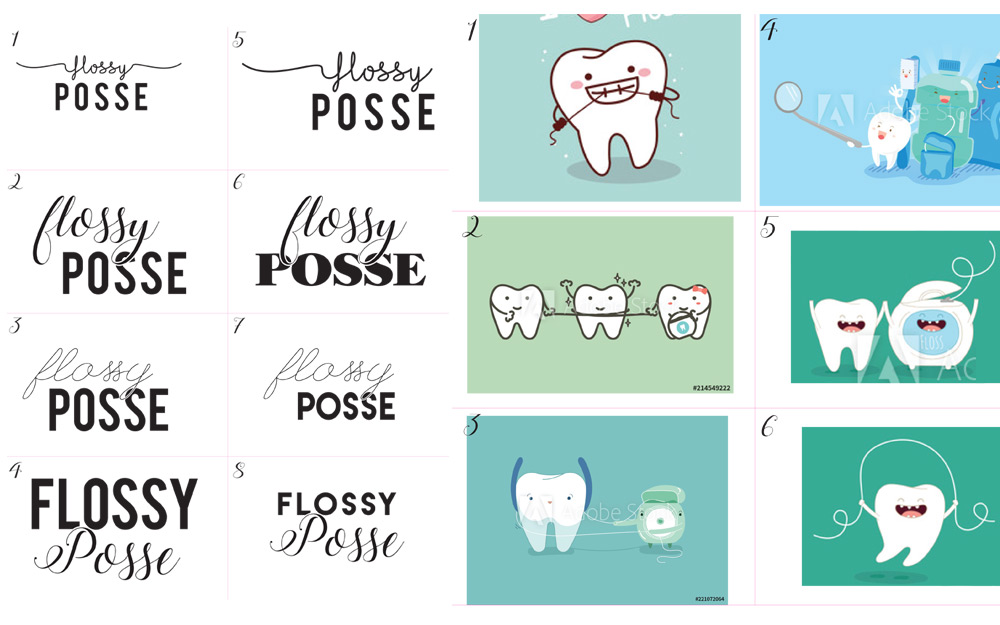
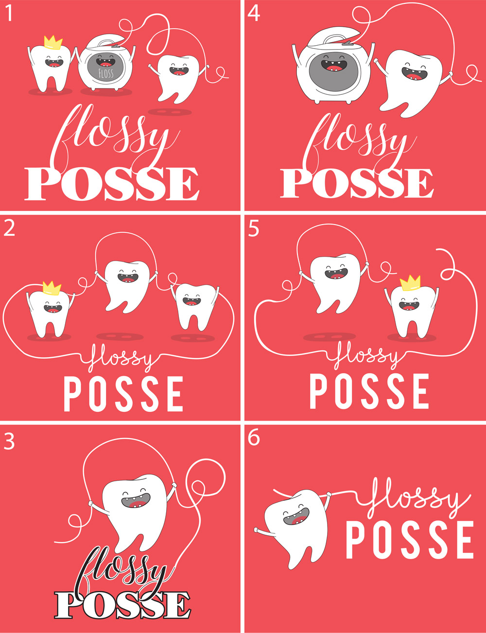
Here are a few ideas I came up with before the final design. Note the “crown” that in my opinion, was worth making this a three-color print!
One slight hiccup at the end was a question on swapping to blue shirts. I proofed it both ways but pointed out how the tongue works with a two-color print:
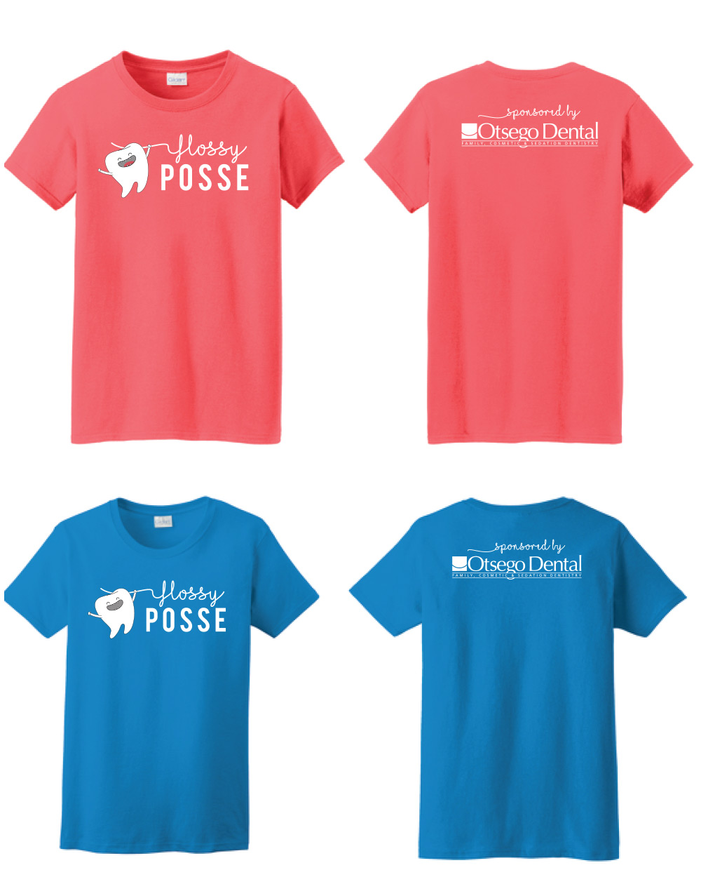
That tongue was the dealbreaker in deciding on a “salmon” pink.